Visual Identity Design: BIG Basketball Inclusive Games
At our agency, we love diving into full brand identity projects. It’s where our designers really get to shine, pouring their creative juices into what often becomes a chef d’oeuvre.
Background
The client was Basketball Club for People with Disabilities “Levski”. reached out with an exciting challenge. They needed a visual identity for an upcoming sports event funded by a European Union grant. While they had plenty of experience on the court, working with design agencies was new territory for them. Despite this, they had a clear vision of what they wanted their sports logo to convey—a mix of European flair, a focus on wheelchair basketball, and a nod to their Bulgarian roots.
The Challenge
We were given a verbal brief (cue the raised eyebrows) with a list of requirements. The logo needed to feel European, communicate the essence of wheelchair basketball, and emphasize that the project was rooted in Bulgaria. Oh, and it also had to show continuity with the club’s existing logo. No big deal, right? To top it off, we didn’t have any examples or benchmarks to guide us—a big mistake!
Our concerns came from trying to juggle too many messages could dilute the focus. We risked ending up with a logo that was either cluttered with competing elements or completely missed the mark. Another challenge was ensuring that the logo would look sharp on everything from big banners to small promotional items—a tricky task when you’re avoiding tiny details that could get lost in printing.
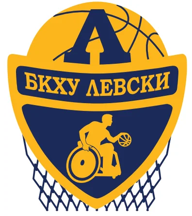
Exhibit 1: Reference of related organization – Basketball Club for People with Disabilities “Levski”
The Working Process
We didn’t exactly start off on the right foot. The initial designer, who wasn’t particularly passionate about sports, found themselves struggling to connect with the project. It was a classic case of running on empty when it came to inspiration. But, instead of switching gears and bringing in a designer who might resonate more with the theme, we pushed forward—lesson learned.
Exhibit 2. New BIG logo proposals

As you might guess, the first round of designs didn’t hit the mark. The client wasn’t thrilled with any of the proposals, and we found ourselves at a creative dead-end.
But then, the client started to get more involved, sending over examples of logos they liked. This was key, even if it came a little late in the game.
Exhibit 3. Benchmark examples for the new BIG logo provided by the client


With just three weeks to go before the hard deadline, and after a few bumps in the road, we handed the project over to another designer. We crossed our fingers and hoped for a slam dunk. Luckily, our new designer knocked it out of the park on the first try. The client chose a Bulgarian rose as a regional symbol, and we wove it into the design valiantly.
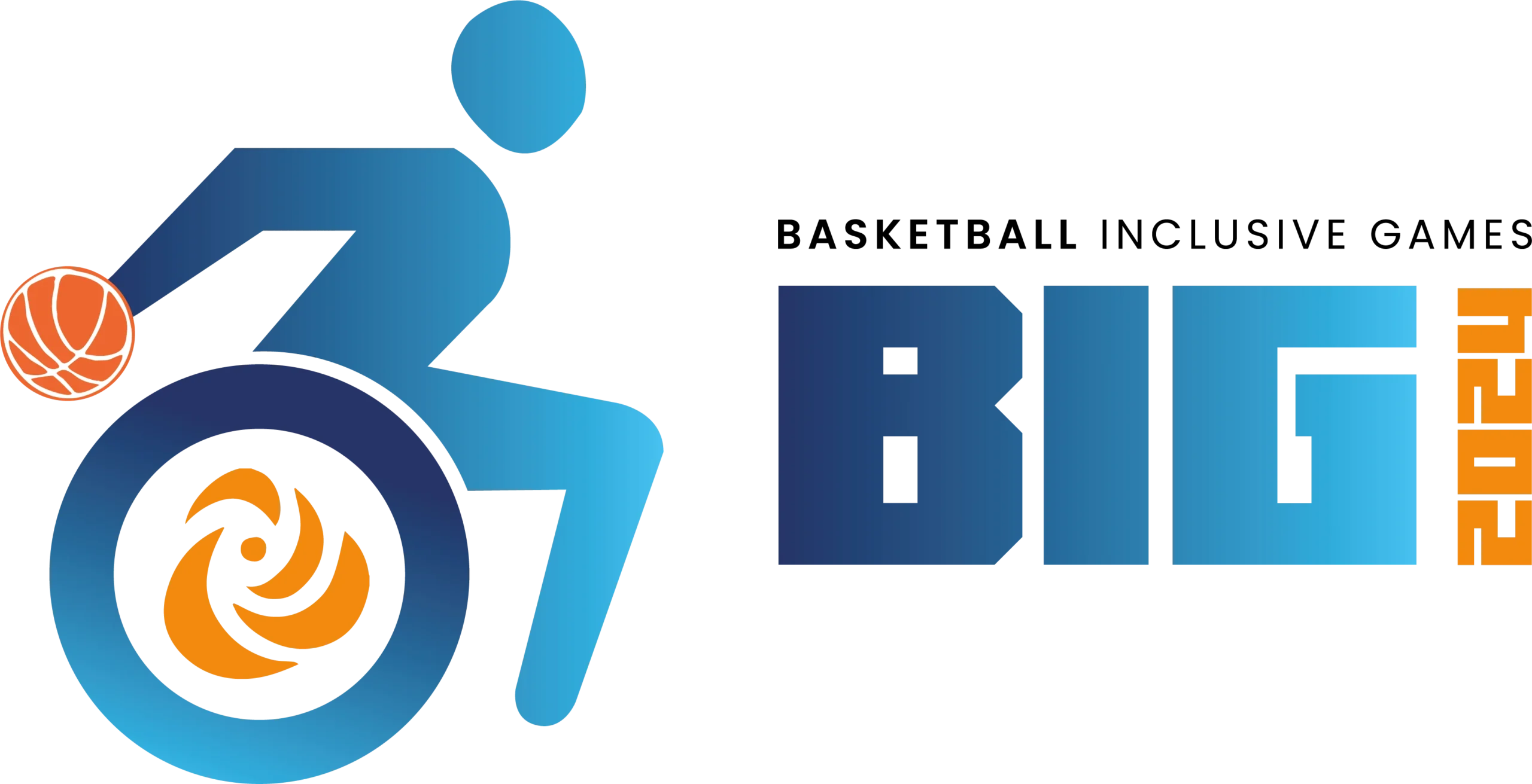
Exhibit 4. Final version of BIG logo

The Final Product
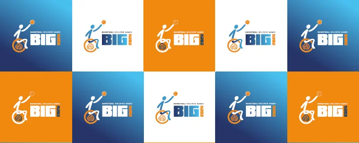
The final logo featured the requested light and dark blue gradient, a touch of orange (a classic basketball color), and a bold, dynamic font that conveyed energy and strength—perfect for empowering para-athletes. We included the event year, project name, and the universal symbol for wheelchair users. The logo was versatile enough to be used across various promotional materials, from pens and notepads to banners and folders, all of which we delivered on time.
Exhibit 5. Possible applications of the logo

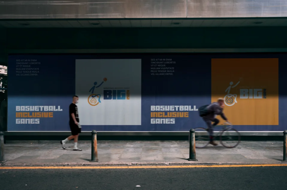
Exhibit 6. Example of advertising materials


Simultaneously, we were developing a website by the same request bigbasketball.org . The brief required developing the copy and specific functionalities. The website isn’t maintained by our agency and some visual changes occurred but you can see screenshots from the initial build.
Exhibit 7. Screenshots from the initial launch of bigbasketball.org/
Takeaways
This project may not be one we look back on with the most pleasure, but it has certainly been the one that taught us the most. We are grateful for the opportunity to work on such a multifaceted assignment, with a tight deadline and international reach. It reminded us of important lessons about the demands of business relationships and the essential role of human creativity and motivation, which must always be respected and prioritized.
As Shakespeare noted 400 years ago, “All’s Well That Ends Well.” The kick-off meeting went exceptionally well, and everyone was pleased in the end. However, there are a few things we could have improved:
- Set clear boundaries from the start – Boundaries are crucial for both sides of the relationship. They serve a protective function and guide participants’ behavior. It’s important to verbalize your boundaries, especially when working with a new client: define your working hours, when it’s acceptable to receive calls, and what information or resources are necessary from both sides for the successful completion of the project. When both parties clearly communicate and agree on these conditions, expectations are set, and the workflow is streamlined.
- Emphasize the importance of the client’s input – Clients are the experts in their business niche, but you are the expert in your craft. To succeed, you need full and relevant information from the client, prioritized in line with their specific requirements. If this input is lacking, the project is set up for failure. Create a concise brief form that gathers all the necessary information, and work closely with the client to fill it out. When discussing references, it’s also a good time to set boundaries on how much influence the client will have on your work. Remember, you are the artist, and it’s your responsibility to ensure that your work is both relevant and effective for the business case.
- Understand the client’s level of technical knowledge – It’s common to assume that others know what you know. Take the time to gauge the client’s technical understanding and ensure they are capable of making informed decisions. If they aren’t, it’s your job to educate them and weigh the pros and cons of their choices. Clarify the consequences of technical misunderstandings, such as what a “working file” is in formats like .ai and .psd, or what a RAW file from a photoshoot entails. It’s also important to define who is responsible for delivering various components, whether it’s third-party contractors, freelancers, or others.
- Know when to push and when to hold back – This can be tricky, as sometimes it’s necessary to apply healthy pressure to boost team efficiency, while in other cases, it can be damaging. A manager’s responsibility is to monitor the team’s resource levels and watch for signs of burnout. Keep in mind that these symptoms are often subtle and non-verbal. In chaotic and unpredictable situations, the manager must decide what’s more important: keeping the client happy or preserving the well-being of a valuable team member. In the world of advertising, we believe no project is significant enough to justify compromising someone’s emotional well-being.
